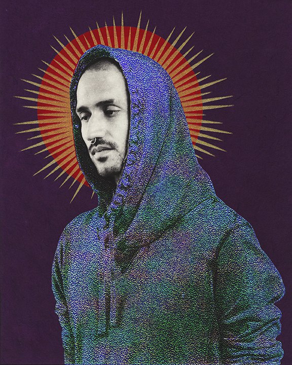
Gabriel Garcia Roman is a Mexican-American visual artist best known for “Queer Icons,” a series that depicts queer subjects haloed amid glittering verses of poetry and striking patterns. Using vivid colors and a portraiture style that references Renaissance and Saint-like postures, Román transposes queer people of color into positions of royalty and martyrdom. The chosen figures of Román’s pieces are undocumented poets, sex worker organizers, body positive femmes, and other activists who only add to the aesthetic vitality of the works.
The Zacatecas-born, Chicago-raised artist uses intaglio printmaking with delicate additions of collaged material and other screen-printing techniques to make his elaborate prints. Seeing a digital reproduction of one fails to convey its exquisite craftsmanship. The frames are also handmade, sculpted from vintage frames and wooden pieces. Román’s skillful artistry as well as his chosen theme of queer visibility make his first solo show at Newark’s Gallery Aferro something you shouldn’t miss. I had a chance to speak with the artist at his Harlem residence about his work and inspirations.
It’s interesting that you choose Catholic iconography considering the church’s complicated history with homophobia and misogyny. Why reference Catholic images in your work?
I use Catholic iconography because I grew up Catholic. Catholicism is so ingrained in Mexican culture. I don’t have to go to church to know what the Virgen de Guadalupe or St. Anthony looks like. Growing up I was drawn to all of these murals and paintings with beautiful glittery frames. I’d say religious art was my first introduction to art. I remember that no matter what was happening in the background, even if the saints were suffering, they were still portrayed as noble. That’s what I wanted to take from those images and put into my series. It wasn’t to be controversial or to say, “Fuck you church.” To me, it made sense because this is what I had to work with in my list of experiences. I wanted to merge that imagery with my community that I hardly ever see represented anywhere.
Mitchyll, 2014. From the series ‘Queer Icons’.
In some of the comments on the articles written about me, people were upset because I was using religious iconography. At the same time I also get messages from people who are Catholic and queer who say, “Thank you for not shying away from representing us in this light.”
My favorite piece in the series of Queer Icons is ‘Mitchyll’ as la Virgen de Guadalupe. Can you tell me about that piece?
Mitchyll is actually the reason why I started focusing on activists. Nobody tells them to go out there and fight for sex workers’ rights or immigration rights. It’s in them to put that at the forefront. Mitchyll’s portrait took me into this other realm of making my work more focused on activists and community organizers.
I can see why they [compare me to Kehinde Wiley], because not many artists focus on depicting people of color. But that should show you how homogenous the art world is.
Considering that, how do you choose your subjects?
I usually start these projects with my friends and then do a public call or through recommendation. Getting Jennicet Gutiérrez to do the portrait for me was a big deal. She’s the one who called President Obama out last year at a pride luncheon. All these gay organizations were invited to the White House because the marriage equality ruling was about to be announced. At the event she started chanting, “Not One More. Stop the detention of queer immigrants!” basically to bring attention to the fact that misgendering immigrants puts them in danger. She was escorted out, but even before that, her supposed “allies” were saying, “This is not for you. Get out of here.” And that was a big slap in the face. It showed the polarization in the gay community between established white gay males versus queer people of color and how the issues they’re fighting for are different. She is the epitome of this project. She’s so outspoken while being undocumented, and for her to protest the president himself… that takes such guts.
What do you think about people who compare your work to Kehinde Wiley?
His work is incredible. I’m a huge fan. I love being compared to him, but I don’t like people to say that I ripped him off. An interviewer recently asked me this question that was kind of assuming, “How did Kehinde Wiley and Mickalene Thomas influence your work?” And it frustrated me because I can’t honestly say I was influenced by them. My culture influenced my work a lot more. I really like vibrant colors and patterns. You go to Mexico, and everywhere you go houses are painted bright colors. There’s gold and gold frames everywhere. I could see why they try to put us in a category because not many artists are focusing on depicting people of color. But that should show you as a critic or art writer how homogenous the art world is.
Carlos & Fernando. 2016, From the series ‘Queer Icons.’
I want to talk about the elevation of queer people of color. Why is that visibility and elevation needed?
I wanted to make the queer trans community of color visible because I wasn’t seeing it represented anywhere. Four years ago was the major push for marriage equality. There were television shows with married gay couples, and sure, that’s great. But why were they all white? I was never seeing myself represented. I was never seeing a queer Latino, Black, Asian anywhere on television. Why is it that the only time I see a queer Black or Latino person anywhere in media is in an ad for HIV medication? That’s why I wanted to insert my narrative not just in the art world, but in the world in general.
At this point it’s become bigger than me. It’s not just for me. It’s for that 14-year-old kid in the South who has no outlet but on social media. Through my Instagram or Tumblr page they can follow me and see positive imagery of themselves. Ever since the NPR and Huffington Post coverage I get a lot of e-mails thanking me. I’ll never forget. One kid wrote, and all he said was, “You saved my life.”
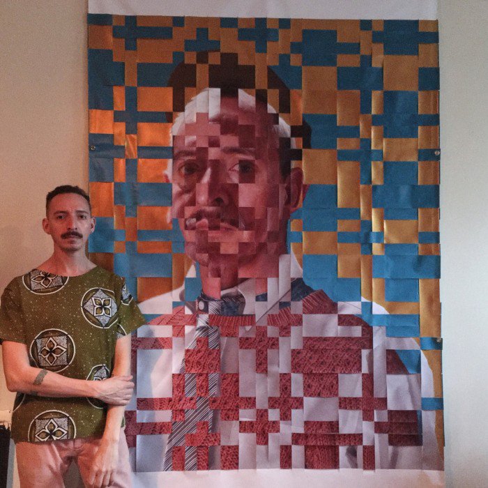
Can you tell me about why you are naming the show ‘To Your Father’ and why you’re literally inserting your dad’s presence in the show with that weaved dual portrait?
The funny thing is that growing up my Dad and I did not have a relationship. He was a strict disciplinarian and was really quick to call you a pendejo or estupido. I harbored this anger toward him up until my late 30s. My mom and my dad were not affectionate at all, no hugs or kisses. My parent were like, “We’re here to work so you can go to school. Here’s your food, do your homework, go watch TV, and leave us alone.” Three years ago, I started working on shifting the narrative that I created about my dad by talking to my brothers who stayed and lived with my parents after I left. Over the years I’ve begun to see my parents in their complexity and how tough it was for them to come to a country where they didn’t know the language and had five mouths to feed.
Gabriel García Román stands next to a woven portrait of himself and his father.
Not until now did I realize it was my dad’s inability to sit still and his constant tinkering with things were characteristics we shared. On the weekends he would be in the garage with his cerveza in one hand and a tool in the other figuring out what was wrong with the car.
Last year I decided I wanted to commemorate my dad’s passing now that I have this newfound love for him. I went back to these images where I had digitally put my image on top of his, aligned the eyes, and literally everything fell into place. I had never even noticed that he had a moustache. We had the same wrinkle, the same jowl thing, everything. I decided to weave them together. That’s why I named the exhibit ‘To My Father’ because now I have the relationship I’ve always wanted to have with him. I feel a lot more resolved about it.


